


Graphic design
The strength of simple ideas
Communication, it is very simple.
Knowing that a correctly put problem is already half-solved, let us begin by asking the good questions.

Who are we adressing?
William Tell knew it: a mistake in the target may be tragic.

What message do we mean to pass on?
To go to the gist, please follow the arrows:
![]() determine the information to be passed on
determine the information to be passed on
![]() dismiss useless or superfluous pieces of information
dismiss useless or superfluous pieces of information
![]() arrange and organize into a hierarchy the retained pieces of information
arrange and organize into a hierarchy the retained pieces of information
![]() determine the best language to communicate this information.
determine the best language to communicate this information.

What image do we want to give?
It is important to tell the image from the message.
Here we are in the field of implicit or suggested meaning, with its
codes, its symbols and also its taboos.
To answer these three questions as precisely as possible is the key of a successfull communication. That implies rigour et method.

But rigour is not rigidity.
A wink, a smile often say more than a long speech.
To find the right tone, to put it clear, to be good at striking a balance
between the various parameters of the relationship, to master the mysterious
alchemy of word and image, it is basically simple...
Logo Des Signes (1999)
Logo Zona Tortona (2007)
Not accepted project
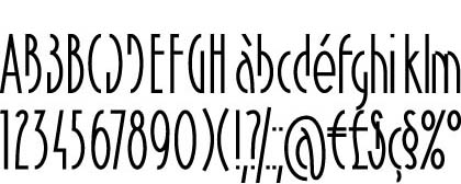
Font Elliptica (2000)
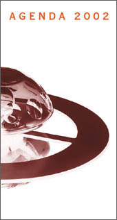
Diary (2001)
Logo Oïkia (2013)
Logo Lieu du design (2014)
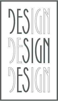
Not accepted project
Logo Beaux-Arts de Paris (2015)
The letter e of the word école becomes a palette with an outline of an embryo, a metaphor for the creative process.
Not accepted project
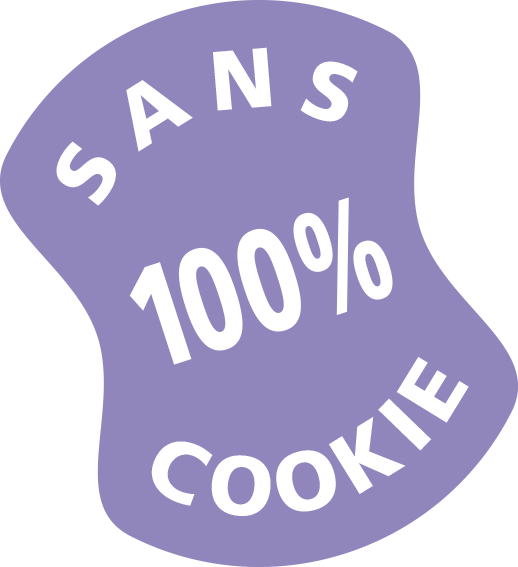
Logo Cookie Free (2017)
Free logo to be reproduced on any website without cookie.
More images here.
Logo proposal for France Travail (2023)
Symbolism of the hyphen.
Proposal for a flag for a reunified Palestine (2023)